Styling the Inbox component
Learn how to style the pre built Inbox component
Customization Hierarchy
The Inbox component is built to allow for multiple layers of styling, which allows the specificity required to style the Inbox to meet the requirements of your use case.
Depending on the level of customization you need, you can choose to style the inbox using one of the following approaches:
- Appearance Prop
- Custom notification rendering - Render a custom notification item with complete control
- Custom Composition - Compose our components for custom layouts
You can see Styling in action on the Inbox Playground with common themes like Notion, Reddit and more!
Appearance Prop
The appearance prop can be used to customise the Inbox. It has three main keys: baseTheme, variables and elements.
- Variables: Global styling variables that apply to multiple elements within the inbox.
- Elements: Elements are the individual UI components that make up the Inbox.
- Base theme: This is the base theme applied to the
<Inbox />. It has the same keys asappearance. Used for applying base themes likedark.
Variables
Variables are used to define global styling properties that can be reused throughout the inbox. You might want to use variables to the styling of multiple components at once, for example, if you want to change the border radius of all the components at once, you can do so by updating the colorPrimary variable, which will modify the CTA buttons, unseen counter and etc...
| Prop | Type | Default |
|---|---|---|
borderRadius? | string | - |
fontSize? | string | - |
colorShadow? | string | - |
colorNeutral? | string | - |
colorCounterForeground? | string | - |
colorCounter? | string | - |
colorSecondaryForeground? | string | - |
colorSecondary? | string | - |
colorPrimaryForeground? | string | - |
colorPrimary? | string | - |
colorForeground? | string | - |
colorBackground? | string | - |
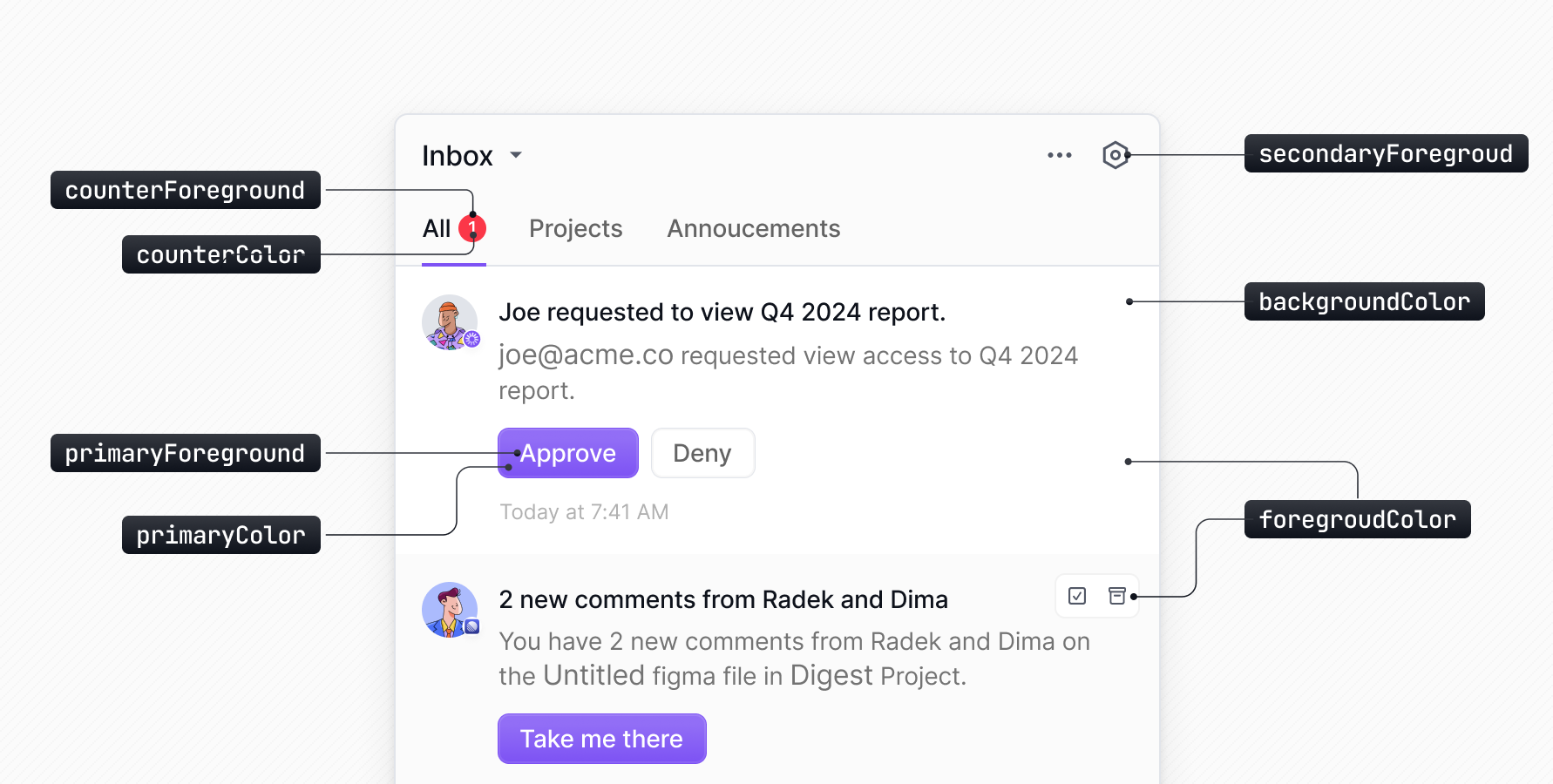
Styling Variables
You can override the default elements by passing your own styles or CSS classes to the elements object.
Elements
The elements object allows you to define styles for these components. Each key corresponds to a component, and the value is an object containing style properties or you can also pass your css classes. Here's a list of available elements that can be styled using the elements object in your appearance configuration:
Finding element selectors
You can inspect the elements you want to customize using the browser's dev tools, each element has a unique selector that you can use to style starting with nv-.
Strip the nv- prefix when and add it to the elements object. For example, to style the nv-notificationPrimaryAction__button element, you can add the following to the elements object:
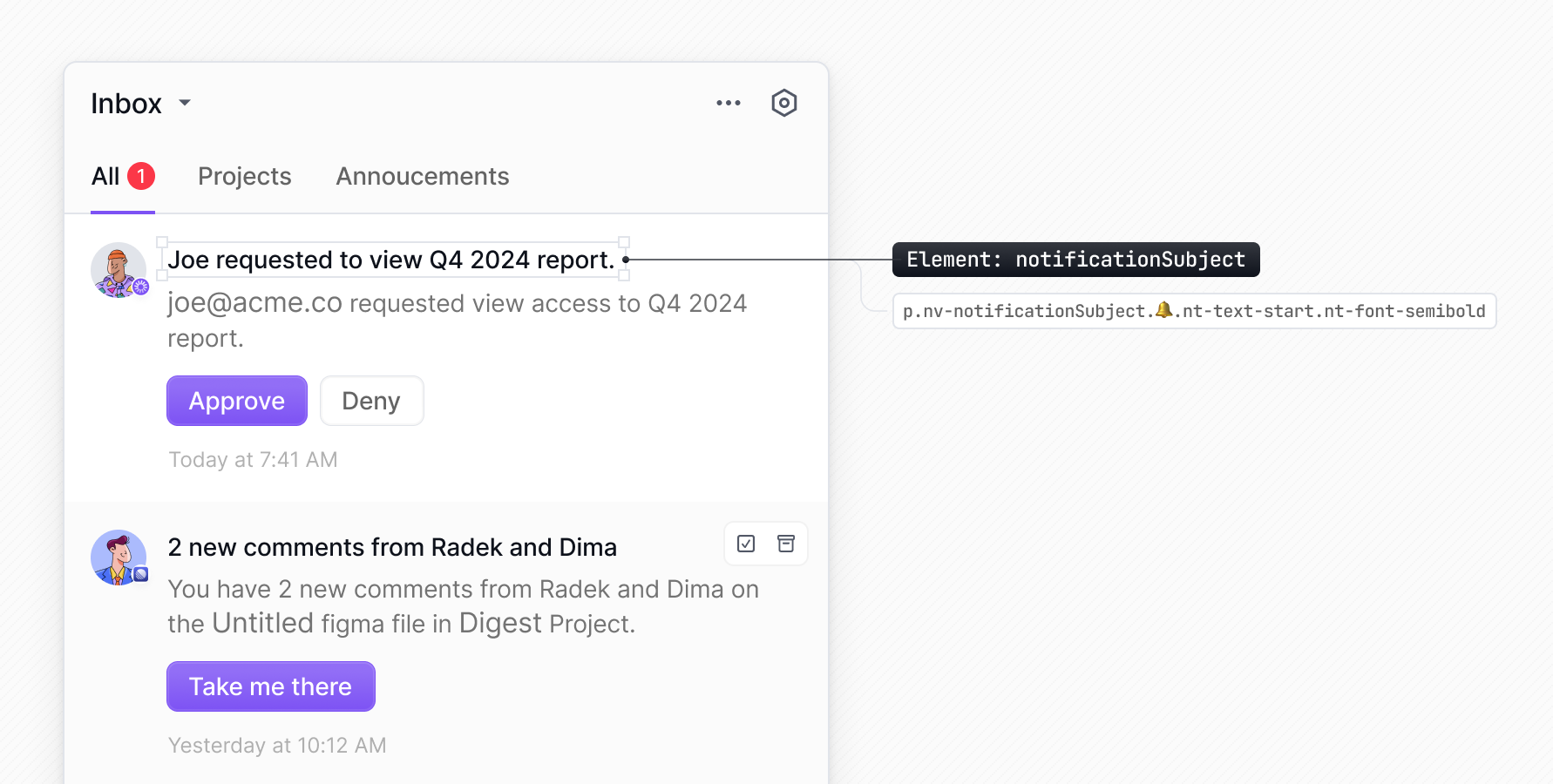
Any selector that appears before the 🔔 emoji, can be targeted via the elements property in the appearance prop (stripping the nv- prefix). You can also use TS autocomplete to find the
available elements.
Customizing icons
The icons property in the appearance prop lets you customize any icon used in the Inbox component. This is useful when you want to:
-
Match the bell icon with your host app's navbar icon set. – Use your own icon library, such as react-icons or Material Icons.
-
Modify all icons to fit your application's visual style.
For each icon you want to customize, provide a function that returns your custom icon as a React component.
List of customizable icon keys
Use these keys in the appearance.icons property to customize specific icons in the Inbox component:
| Icon Key | Description |
|---|---|
arrowDown | Down arrow used in drop-downs and expandable sections |
arrowDropDown | Drop-down arrow in menus and selectors |
arrowLeft | Left arrow used in pagination and navigation |
arrowRight | Right arrow used in pagination and navigation |
bell | Notification bell icon in the header |
chat | Chat channel icon in notification preferences |
check | Checkmark icon used for selected items |
clock | Date/time display for notifications |
cogs | Settings/preferences icon in the header |
dots | More options menu (three dots) in notification items |
email | Email channel icon in notification preferences |
inApp | In-app channel icon in notification preferences |
markAsArchived | Icon for archiving notifications |
markAsArchivedRead | Icon for marking notifications as archived and read |
markAsRead | Icon for marking notifications as read |
markAsUnread | Icon for marking notifications as unread |
markAsUnarchived | Icon for unarchiving notifications |
push | Push notification channel icon in preferences |
sms | SMS channel icon in notification preferences |
trash | Delete/remove icon for notifications |
unread | Indicator for unread notifications |
unsnooze | Icon for unsnoozed notifications |
You can inspect the Inbox component using your browser’s developer tools to discover icon keys. Icon elements have class names that start with nv- and include a 🖼️ emoji for easier identification. The part following nv- is the icon key. For example, an element with the class nv-cogs has the icon key cogs.
Dark theme
No need to implement a custom dark theme. Just import our premade dark theme and use it via the baseTheme option in appearance.
Bring your own CSS
You can override the default elements by passing your own styles or CSS classes to the elements object.
Using Tailwind CSS
You can also use Tailwind CSS classes to style the Inbox components. You can pass the classes directly to the elements object.
Using CSS Modules
You can also use CSS Modules to style the Inbox components. Here's how you can do it:
- Create a CSS module file
(e.g. styles.module.css)with the styles you want to apply to the Inbox components.
- Import the CSS module file and pass the classes to the elements object.
Using Styles Object
You can also use a styles object to style the Inbox components. You can pass the styles directly to the elements object.
Render subject and body with bold text
By default, the Inbox notification text for the subject and body is rendered in a normal font weight. To highlight important words or phrases within your notification messages, you can wrap the desired subject or body text in double asterisks (**). Here's an example of how you can do this using the Novu Framework:
Note: When rendering the custom notification component, you will need to parse the text and apply the bold styling accordingly.
Currently, the Inbox component only support bold text. Other text formatting options will be available in the future. To learn, refer to the Novu Framework in-app step documentation.
Render notification component
You can render your own custom notification item component by passing a renderNotification prop to the Inbox or Notifications component. This lets you style and render more complex notification items.
The Inbox styles placement
The <Inbox /> component automatically injects its styles into the <head> tag of the HTML document when rendered in the standard DOM.
However, when rendered inside a shadow DOM, it detects the shadow context and injects styles into the shadow root instead. This ensures proper style encapsulation and prevents leakage or conflicts with global styles without any additional configuration.